Bookish Boutique: Validating a Direct Sales Platform Through Technical Prototyping
I built a working marketplace to validate how design decisions scale across a multi-sided platform. The process revealed insights I couldn't have anticipated—like how balancing user control with platform quality standards shaped interfaces from editing tools to checkout flows.
Role
Solo Product Designer & Builder
Scope
Complete multi-vendor marketplace with payment processing
Architecture
200+ components across vendor storefronts, admin dashboards, and checkout flows
Integration
5 third-party services unified into a single platform
Duration
4 months (2025)
Tech Stack


Why This Project
After five years working with independent authors, I heard the same frustration repeatedly:
"Iwanttoselldirecttoreaders,butIdon'thavethetimeorbudgettobuildaprofessionalstorefront."
The existing options were missing key pieces. Generic storefronts buried authors' unique brand identities under one-size-fits-all templates. Custom websites required $10,000+ upfront investments plus ongoing developer fees. E-commerce platforms meant wrestling with confusing plugins and watching fees devour already slim margins.
The Gap
Most platforms handle digital sales adequately, but authors sell across formats. Each format brings distinct operational requirements—audiobooks need instant delivery, paperbacks require shipping calculations, hardcovers involve different fulfillment partners. Authors also need integrated reader engagement and release promotion tools. Standard e-commerce platforms treat books like any other product, missing these publishing-specific workflows entirely.
My research confirmed what authors told me: Over 300,000 independent authors currently juggle 5-6 different services, spending $1,000-2,500 annually on partial solutions. Another 33% plan to start selling direct within the next year. A $2-4B market exists—sustainable rather than venture-scale—serving professional authors who need purpose-built tools.
I built a comprehensive prototype to validate whether one platform could elegantly solve these interconnected problems.
Bookish Boutique gives authors a beautiful website and storefront that feels custom-built, without the custom price tag or setup complexity. The platform handles merchant services, tax compliance, and multi-format fulfillment through a unified system. When we ship improvements, every author benefits.
I spent four months building the complete platform to understand how design decisions compound across a marketplace. Making each format its own product with distinct fields, building visual editors for social share cards, creating focused editing interfaces that match author mental models—these design challenges only revealed themselves through implementation.
The Design Opportunity
To deliver on this value proposition, I considered several design challenges that would differentiate Bookish Boutique from existing solutions:
- Integrated Shopping Experience: Readers needed to browse and buy without leaving an author's site. This meant designing checkout flows that felt native to each author's brand while maintaining consistent functionality.
- Editing Without Overwhelm: Authors felt paralyzed by the layers panels and infinite options of modern website builders. I designed a constrained system with predefined sections they could drag and drop, with customization limited to what matters: color, text, and typography. Each section opens in its own drawer, focusing authors on one task at a time instead of showing them everything at once.
- Managing Backend Complexity: The platform handles merchant services, multi-format fulfillment, print-on-demand, and tax compliance behind the scenes. I designed the admin interface to surface only relevant information at each step—showing shipping options only for physical products—without burying critical features.
- Planning for Platform Growth: New payment methods and fulfillment partners would need to work across every author site automatically. I kept this in mind while designing, using modular templates and dynamic components that could accommodate future features without forcing authors to rebuild their sites.
These challenges shaped design decisions from component structure to editing flows and more. The goal was always to let authors focus on their work instead of the technology.
Building with AI
I set clear boundaries from the start. This was a prototype to test the concept, not production code. Having never built with AI before, I wanted to understand its limits—where it accelerates development and where it becomes a hindrance.
AI changed my design process. Instead of creating wireframes, I went straight from rough Figma sketches to working components. I'd describe what I wanted to AI, refine the output with Tailwind, then extract reusable patterns. This approach let me maintain visual consistency while moving quickly and experimenting with tools—like Framer Motion—I'd never used before.
As the project grew from zero to 200+ components over four months, I learned to maintain coherency across a codebase too large for AI models to grasp all at once. Using existing infrastructure like Swell and Stripe let me focus on these challenges rather than building everything from scratch.
The goal was to build something real enough to validate the concept with actual authors. The process taught me how design decisions cascade through complex systems and how to effectively leverage AI as a design tool.
Design Approach
Platform Architecture Overview
Four-month prototype spanning complete marketplace architecture. Every component was functionally built to validate design decisions across the full system.
Architecture-First Design
Bookish Boutique flipped my typical design process. Instead of starting with UI mockups, I started with system constraints.
I learned Next.js 14's routing system and Swell's commerce API through trial and error. Without a technical background, I hit plenty of dead ends. Each one taught me to understand the boundaries before designing features that pushed against them.
Information architecture came first, visual design second. I needed to know what was possible before deciding what was desirable. Figma became a sketching tool rather than a documentation tool. Rough concepts went straight to code—no detailed wireframes needed. This matched what many design teams have discovered after abandoning wireframes entirely.
Understanding technical constraints shaped better user experiences. Take checkout flows. Knowing that Swell and Stripe needed different data at different steps led me to design smarter paths. Digital downloads skip shipping forms. Mixed carts only show relevant options. The technical understanding focused my creativity on solutions that actually worked.
Traditional Design Process vs. Architecture-First Approach
Traditional Process
Architecture-First Process
Both approaches have their place. Traditional design works well for exploring new problem spaces. Architecture-first design ensures you build something that actually works. This project taught me to match my process to the problem. When building on existing systems, understanding constraints upfront leads to better solutions. That flexibility has made me a more effective designer.
Key Design Decisions
1. Social Share Cards: Satisfying Emotional Needs
Authors were frustrated that sharing their books on social media promoted the marketplace more than their own brand. Most platforms put their logo and branding front and center in share cards.
Share Card Editor

Live Result on Mobile

I gave each author's site its own social share card. Authors upload their image, write their text, and see exactly how it will appear on social platforms. The system handles the Open Graph tags automatically.
Live preview updates instantly as authors customize their social share appearance
This reinforced what made Bookish Boutique different. Authors get their own storefront, not a seller page on someone else's platform. When they share a link, it's their brand people see.
Key Takeaway
Approach features through a lens of addressing your user's emotional needs. Authors didn't just want functional websites—they wanted to feel proud sharing them. I gave authors ownership of their presence while handling the technical details for them.
2. Focused Editing
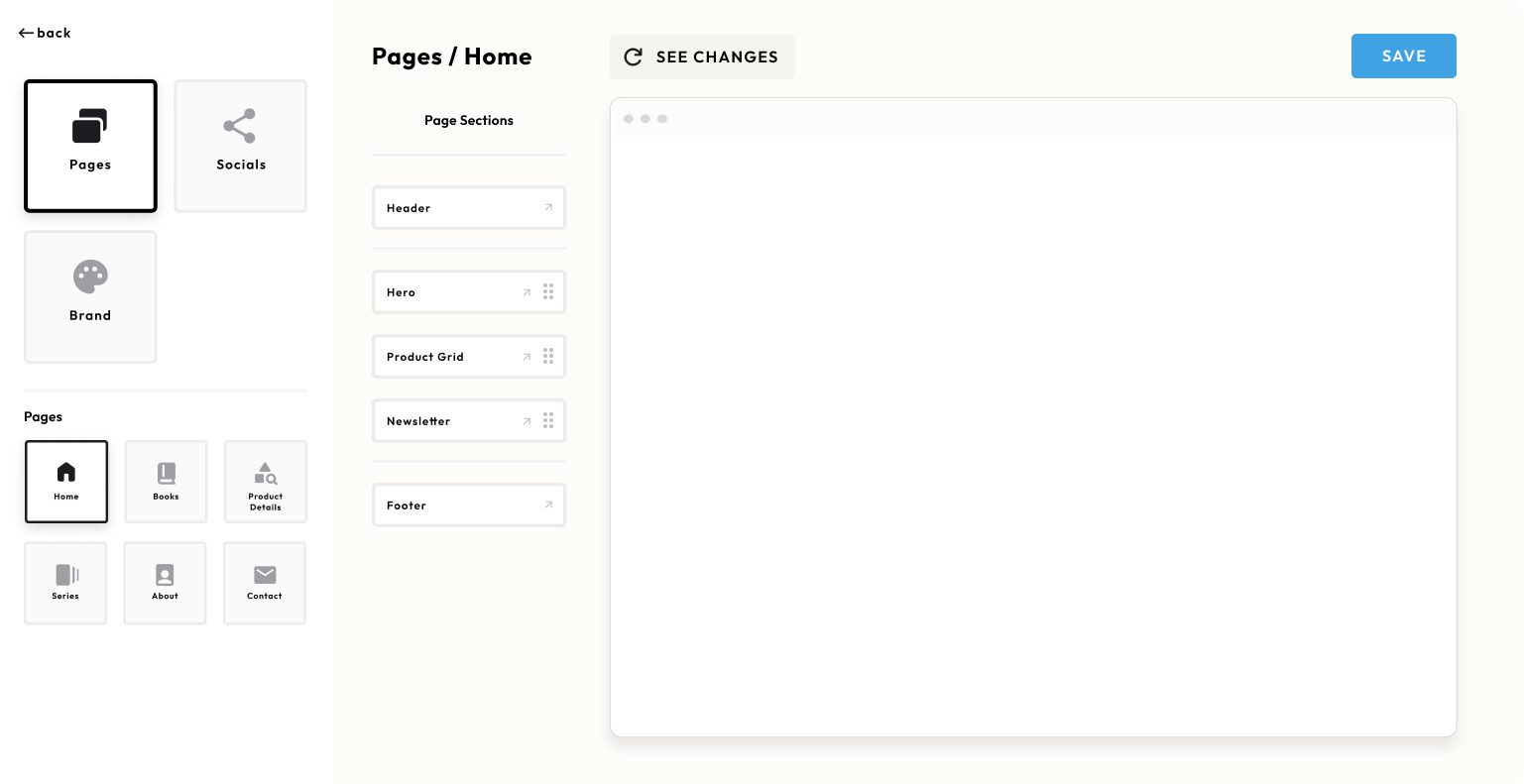
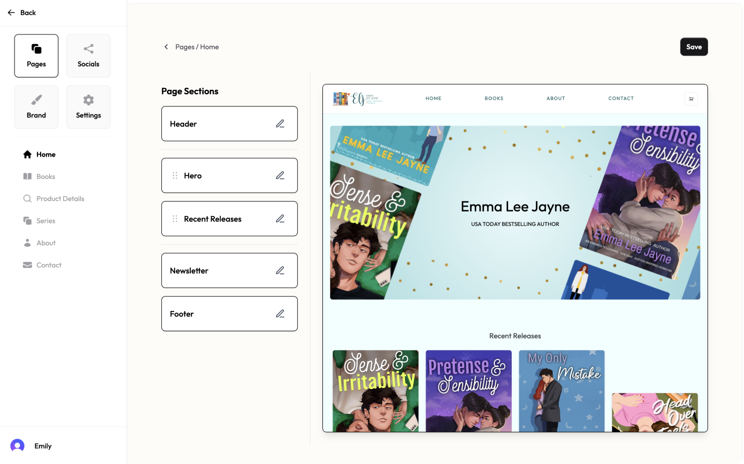
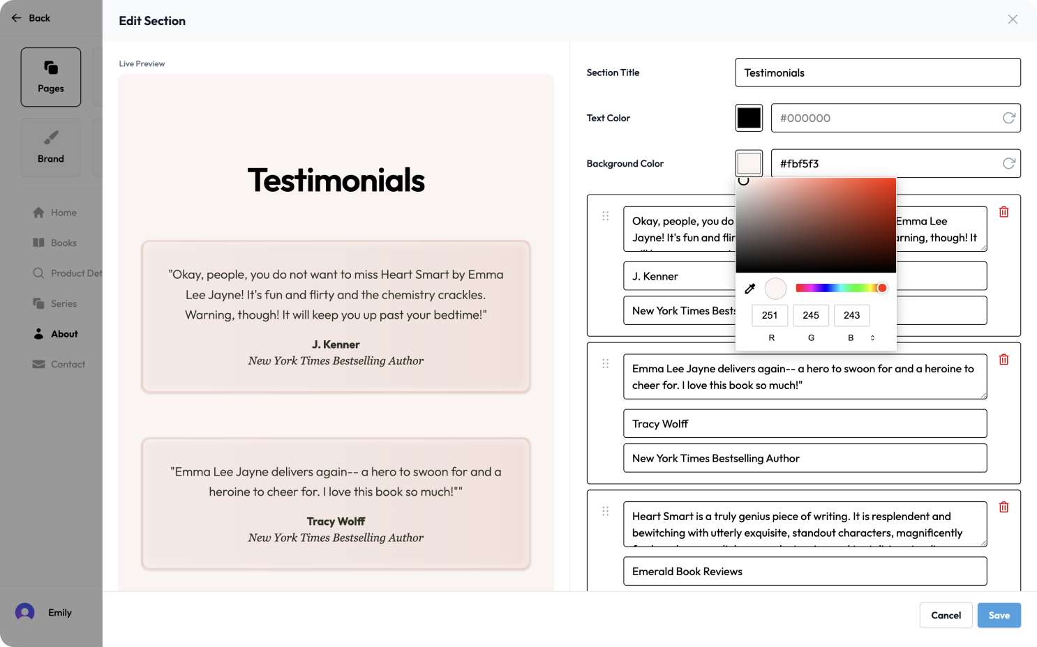
Modern page builders show everything at once—layers panels, property inspectors, component trees. Authors found this overwhelming. They think in terms of page sections, not nested components.
Editing drawer isolates one section at a time, reducing cognitive load and decision fatigue
I designed around progressive disclosure. The main view shows page sections as simple, labeled blocks. Click edit, and a drawer slides over with just that section's controls. One section, one task, no distractions. Changes appear instantly in the preview.
Intelligent Constraints in Action
Smart defaults automatically adjust text color for contrast, with manual override available
The system makes smart decisions by default. Text colors auto-adjust for readability. Spacing maintains consistency. But authors can override anything when they want to. This balance came from recognizing that most authors want good results quickly, with the option to fine-tune later.
Key Takeaway
Match interface complexity to user mental models. Authors see their site as sections, so the editor works in sections. When planning, they see the whole page. When editing, they see one part. The interface adapts to the task, not the other way around.
3. Designing Around API Constraints
I started with standard e-commerce thinking—one product, multiple variants. But Swell's API treats physical and digital products as separate entities. Ebooks and paperbacks need different data fields entirely.
Format selection treats each book type as a distinct product for better flexibility
I worked around the constraint. Each format became its own product with tailored experiences. Audiobook listeners review narration quality. Ebook readers comment on formatting. Print buyers discuss paper quality. The workaround became a better solution.
This structure benefits everyone. Authors can write different descriptions for each format, set independent prices, even stagger release dates. Readers land directly on the format they want. Marketing campaigns can target audiobook listeners separately from print readers.
To users, it still feels simple—just pick your format. But the underlying structure enables much more sophisticated selling strategies.
Key Takeaway
Always consider the ripple affects of a constaint. Swell's "limitation" created clearer purchase paths, better analytics, and more flexibility for authors. Evaluate every constraint by asking who it could actually benefit, not just how to bypass it.
The Value of Building
Design Insights Through Rapid Prototyping
I skipped extensive documentation and went straight from sketches to working prototypes. Building with real content revealed problems that mockups hide.
The drag handle placement looked fine in Figma. In practice, it caused text overflow and crowded the action buttons. Moving it to the left fixed everything—obvious once you could interact with it.
My sub-navigation started as blocks, matching the main navigation pattern. But once I could actually navigate between pages, the blocks felt heavy and slow. The icon list made scanning faster and kept the focus on the page content rather than the navigation itself.
The biggest revelation came from removing features, not adding them. I'd built a "See Changes" button because that's what CMS interfaces do. But once real-time updates worked smoothly, the button felt like unnecessary friction. Watching sections reorder instantly as authors dragged them changed the entire feel. It transformed the UX from filling out forms to directly manipulating content.
When Performance Shapes Design
Small interactions made a bigger impact than expected. Switching between book formats on the authors' Books page felt clunky until I added Framer Motion animations. Watching books smoothly reorder themselves when filtering by format transformed a functional feature into something that felt polished.
Having the ability to tweak Framer Motion settings until animations feel "just right" is the kind of transformative design depth that mock-ups don't reach. I couldn't have prototyped this animation in Figma. Being able to test multiple variations of the animations, adjust speeds, and reordering logic all within minutes made the design process more iterative and responsive to real user needs while achieving a level of polish that would be hard to achieve with static designs.
Reflection
Design Takeaways
Building Bookish Boutique helped me grow as a product designer. Working with real commerce APIs, payment systems, and multi-vendor architectures revealed the gap between what seems logical in Figma and what actually works in practice.
Sometimes constraints became design opportunities. Swell's product structure pushed me toward a cleaner format-based architecture. Building actual checkout flows showed me where users need guidance versus freedom. Implementing the drag-and-drop editor taught me which interactions need polish and which just need to work.
Strategic Outcome
Over four months, I built a complete marketplace—multi-vendor storefronts, admin dashboards, payment processing, and a visual site builder.
The prototype validated core assumptions about what authors need and what readers expect. More importantly, it gave me hands-on experience with the technical decisions that shape user experience in ways mockups can't reveal.
Moving Forward
This project changed how I collaborate and approach systems-level design. I ask better questions because I've felt the constraints myself. I can better discern between "technically possible" and "worth building" because I've built both.
Additional Screens
A comprehensive view of the platform's key interfaces
Visual Page Builder
Drag-and-drop interface for creating custom storefronts
Section Editor Drawer
Focused editing interface that isolates one section at a time
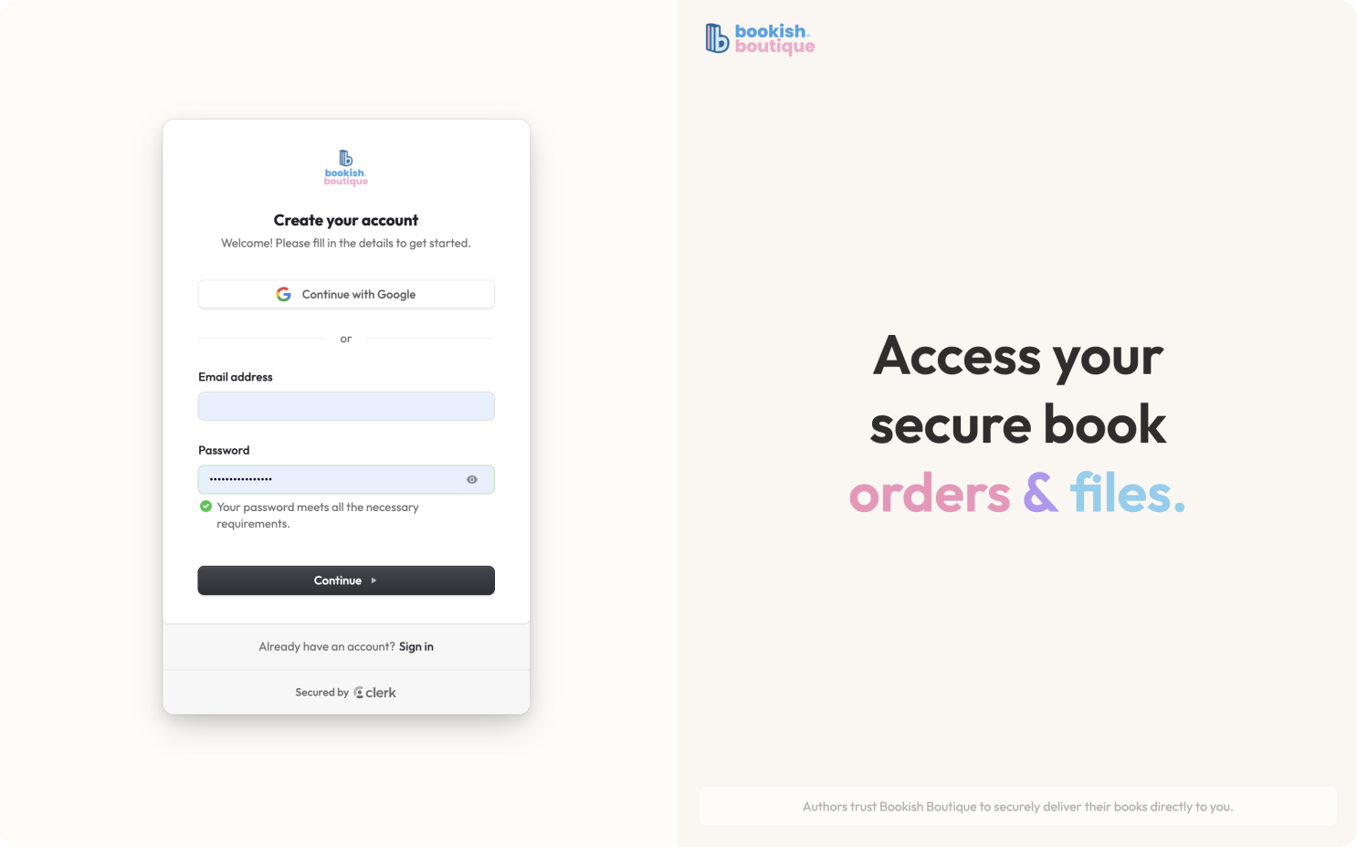
Authentication
Seamless login experience powered by Clerk
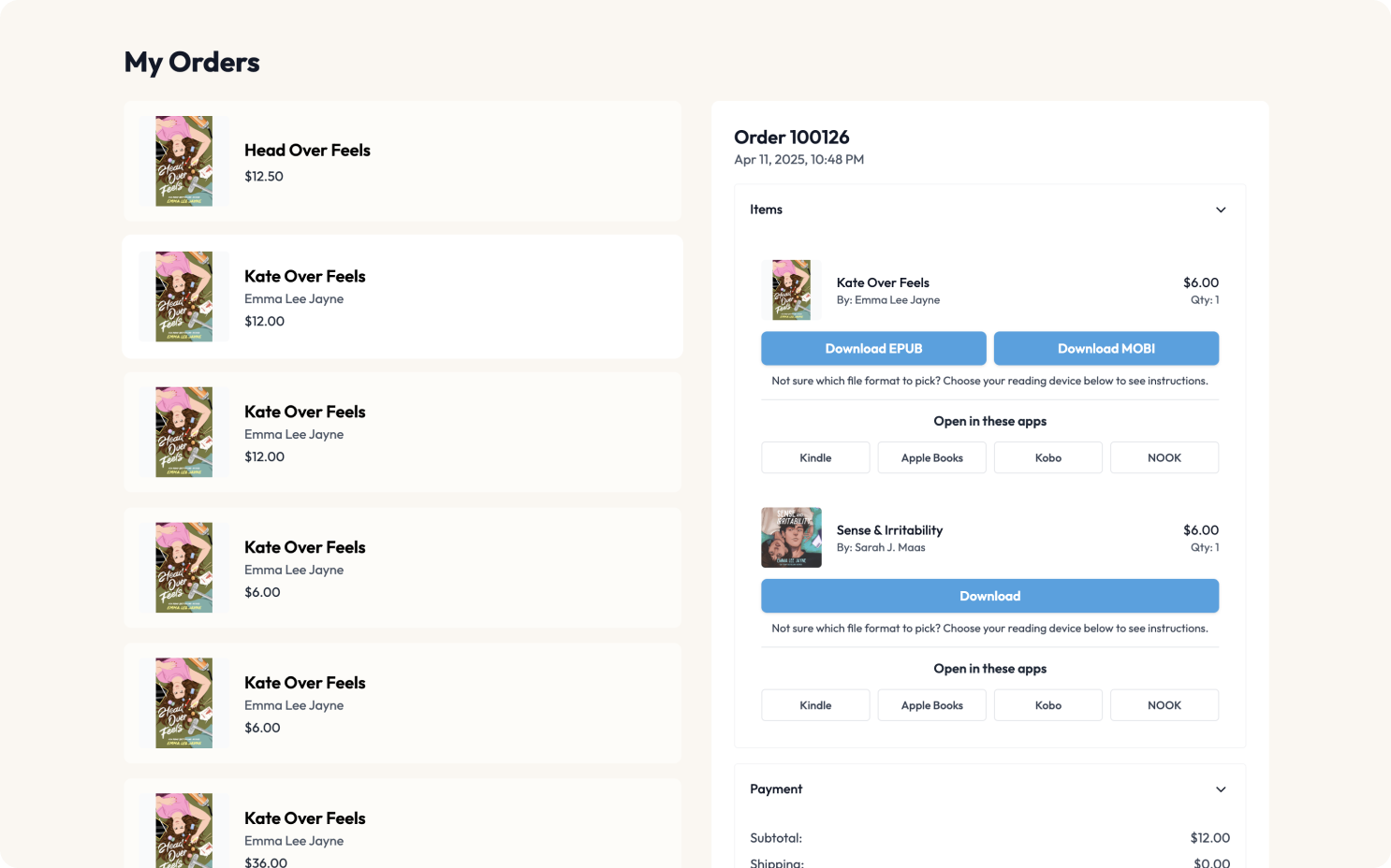
Customer Order History
Clear order tracking with download management
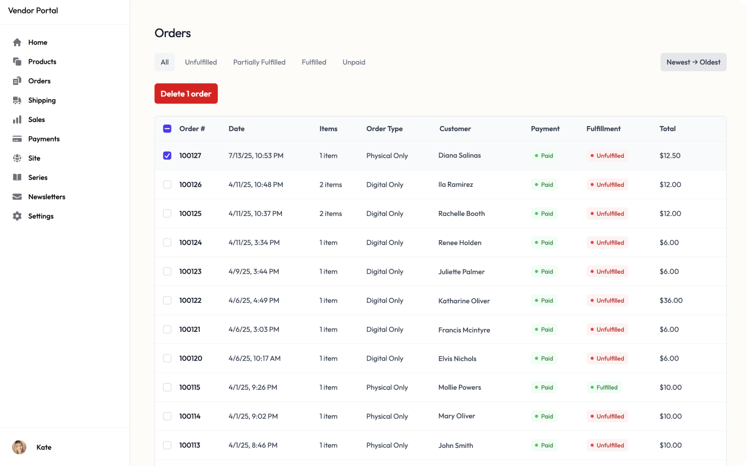
Order Management Dashboard
Comprehensive vendor order processing interface
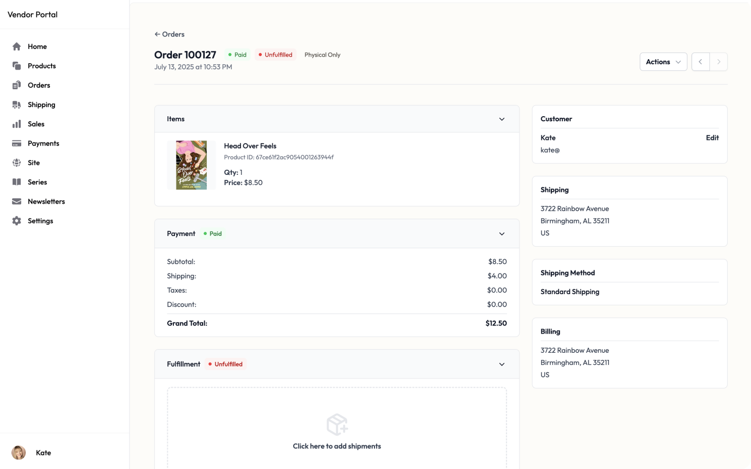
Order Fulfillment
Detailed order view with shipment tracking
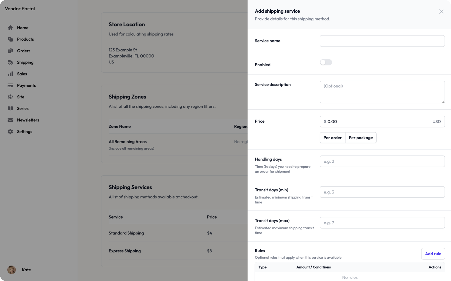
Shipping Configuration
Flexible shipping rules and zone management
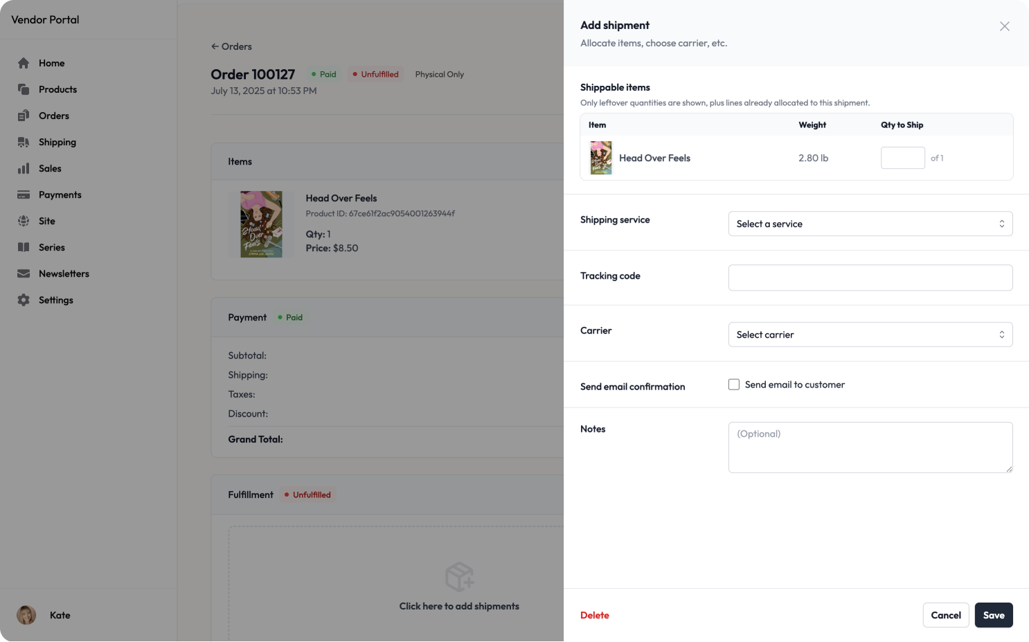
Shipment Processing
Streamlined fulfillment workflow for vendors