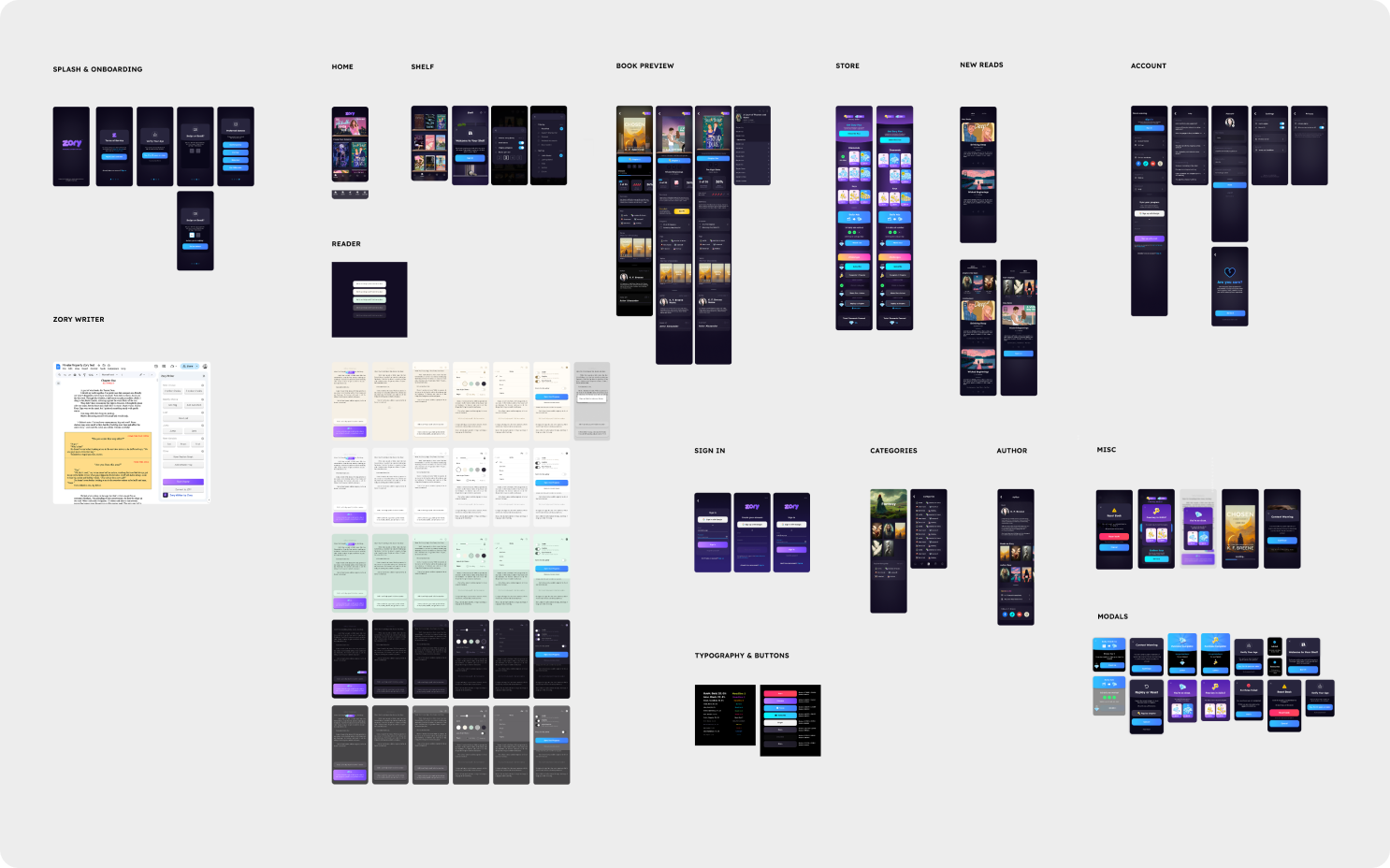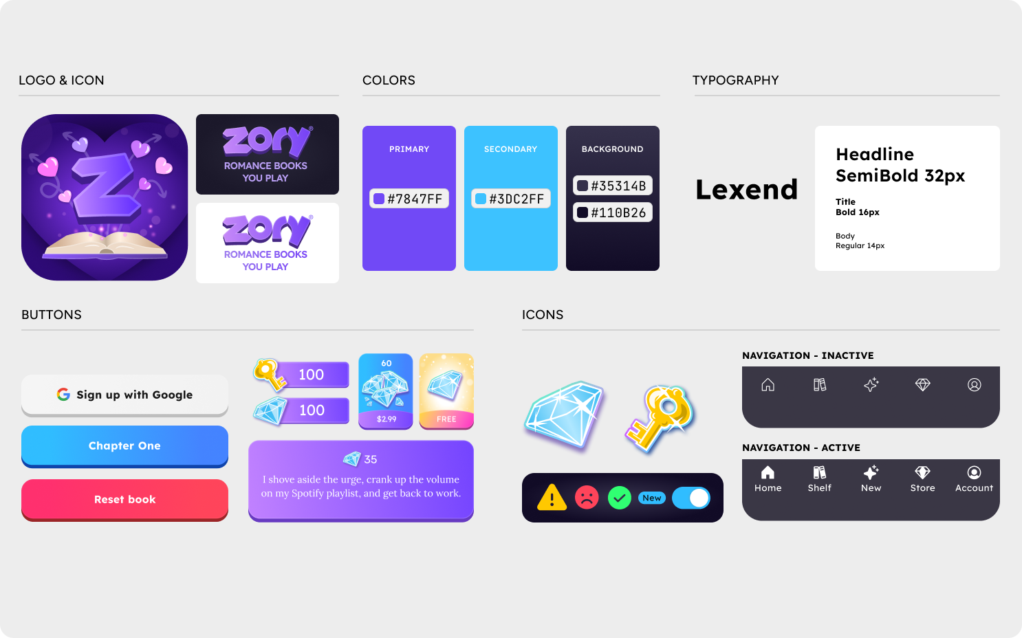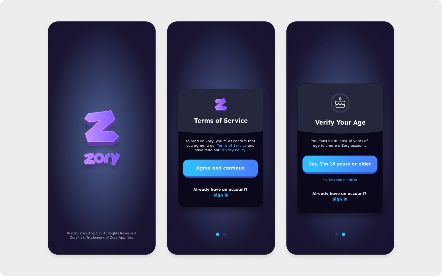


Key Design Decisions
1. Choice Architecture: Designing Seamless Interactive Moments
Interactive fiction typically treats choices as interruptions—modal dialogs that break narrative flow. At Zory, we explored whether choices could feel like natural extensions of the reading experience itself.
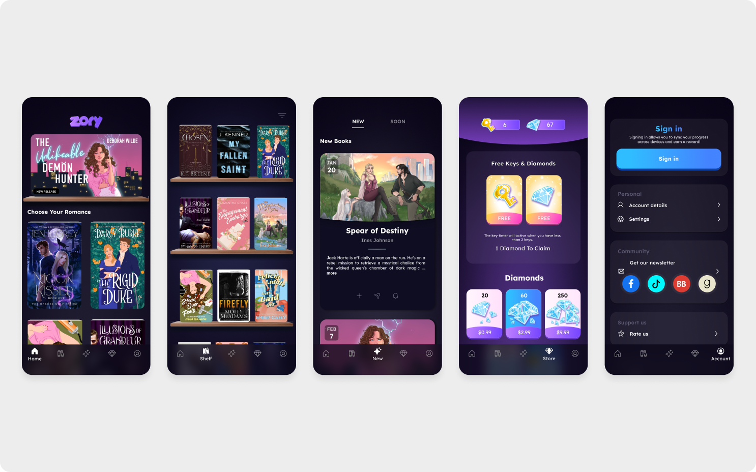
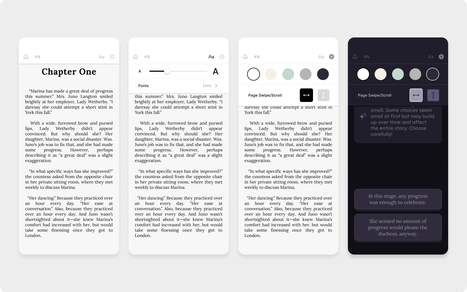
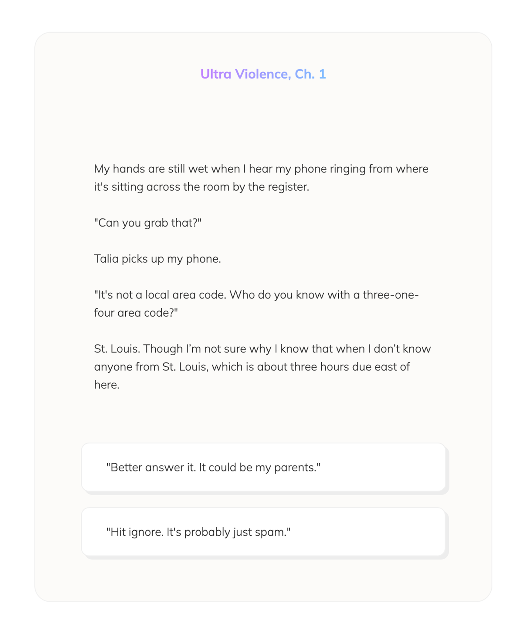
We decided choices would always appear at the bottom of the reader page, creating predictable placement. When content demanded more room, choices would flow to the next page but maintain that bottom position.
We worked with writers to ensure decision points had emotional context through narrative priming—inner monologues revealing conflicting desires, dialogue building tension without telegraphing options. When choices appeared, readers had context for their decision rather than facing arbitrary options.
Choices appeared via staggered animations triggered by scroll/swipe position rather than waiting statically on the page. The pop-in animation added a moment of delight that signaled an interactive moment without disrupting reading flow.
Premium Choice In Action
The button appeared raised and sank into the page when pressed. Haptic feedback reinforced the interaction. Upon selection, the chosen text animated from the button into its position as the next line of narrative, while unchosen options faded away.
From Concept to Production
Early Vision (Keynote, 2020)
Original concept animated in Keynote before having access to prototyping tools
Refined Prototype (Rive)
Prototyped in Rive to explore timing and personality
Shipped Experience (Flutter)
Final implementation with refined animations
Before I had access to prototyping tools or a technical co-founder, I used Keynote to animate my vision for how choices could feel delightful and integrated. This early concept—complete with pulsing 'tap to continue' and currency indicators—became the foundation for everything we built.
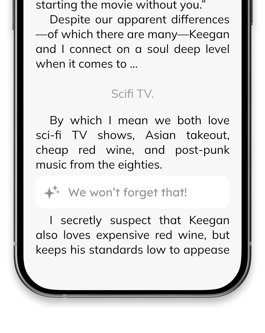
The integrated choice text was styled slightly lighter than surrounding narrative and was centered—a subtle acknowledgment of reader agency without disrupting flow. A staggered reveal animation unveiled the continuation, creating a sense of the story responding to reader input.
Premium choices used the same interaction system with added sparkle animations created in Rive. This maintained consistency while adding visual value to paid options.
Premium Choice Animation
Qualitative feedback consistently highlighted the seamless integration of choices. Beta testers described feeling "inside" the narrative and reported that choices felt like "part of the story" rather than interruptions.
Key Takeaway
Good design dissolves into the experience. Our choices animated directly into the narrative text because that's what they were—the next line of the story. The interface became the story itself.
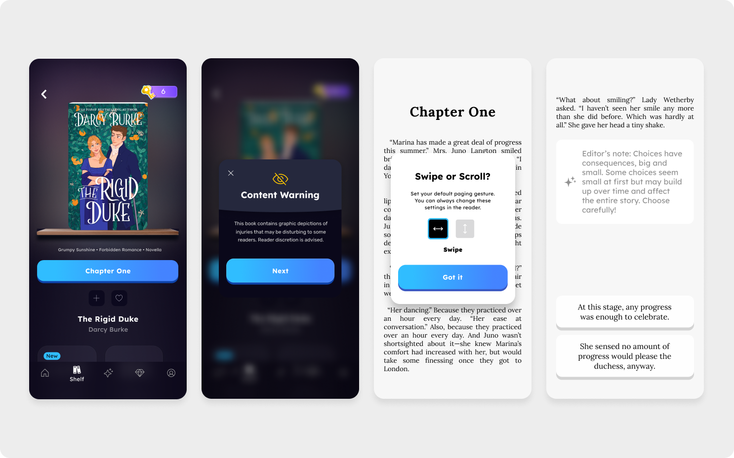
2. Editor's Notes: Scaffolding Reader Understanding
After soft-launching, we discovered readers faced a cognitive gap between making choices and experiencing their consequences. A choice in chapter 8 might fundamentally alter the story, but its impact wouldn't become apparent until chapter 15. This disconnect caused confusion and contributed to reader drop-off.
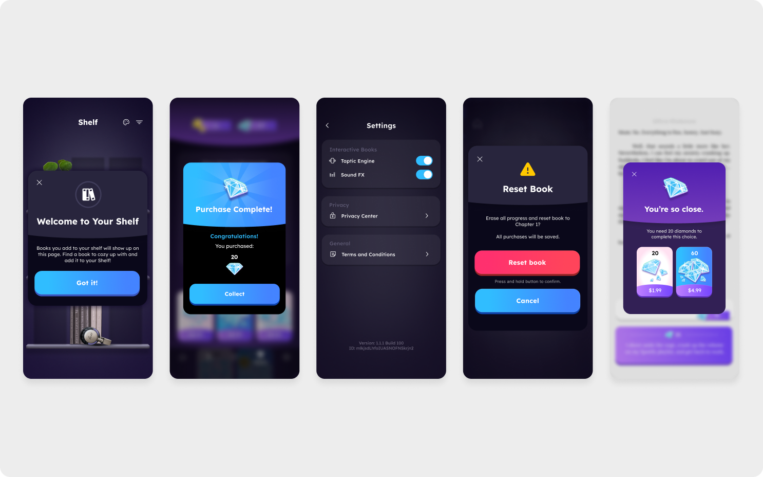
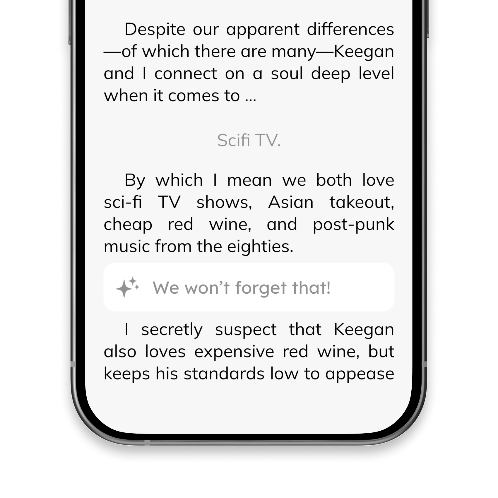
Our solution was Editor's Notes—contextual messages that appeared before and after key choices. These served multiple purposes: onboarding new readers into how interactivity worked, celebrating monetized choices with positive reinforcement, and most importantly, letting readers know their choices would have significant consequences down the line.
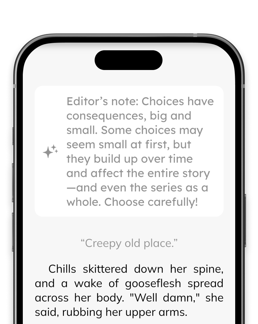
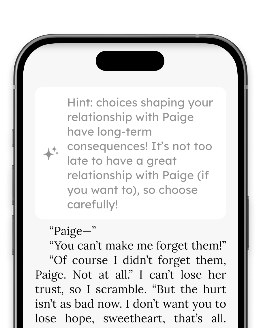
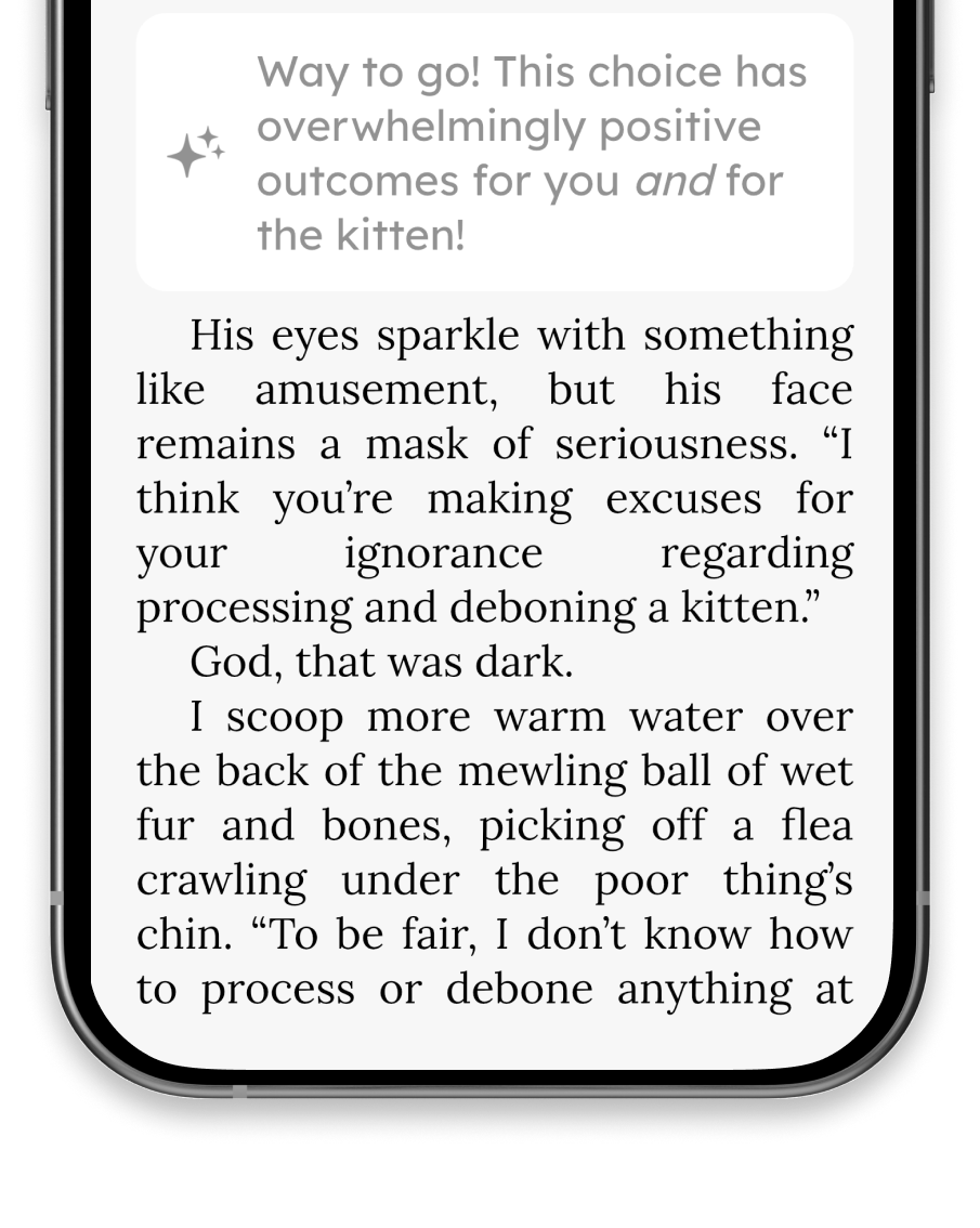
We implemented this feature delicately. We needed to provide just enough information to maintain reader confidence without spoiling future plot points. Notes like "This choice will significantly impact your relationship with this character" gave readers the assurance that their decisions mattered, even when the immediate narrative seemed to continue unchanged.
Beta testers in our Discord reported that Editor's Notes improved their understanding of the interactive format and increased confidence in their choices. Several readers noted that knowing their choices would have later consequences maintained engagement through transitional chapters.
Key Takeaway
Never leave users wondering if their action matters. When users take action, acknowledge it immediately, even if the results come later.
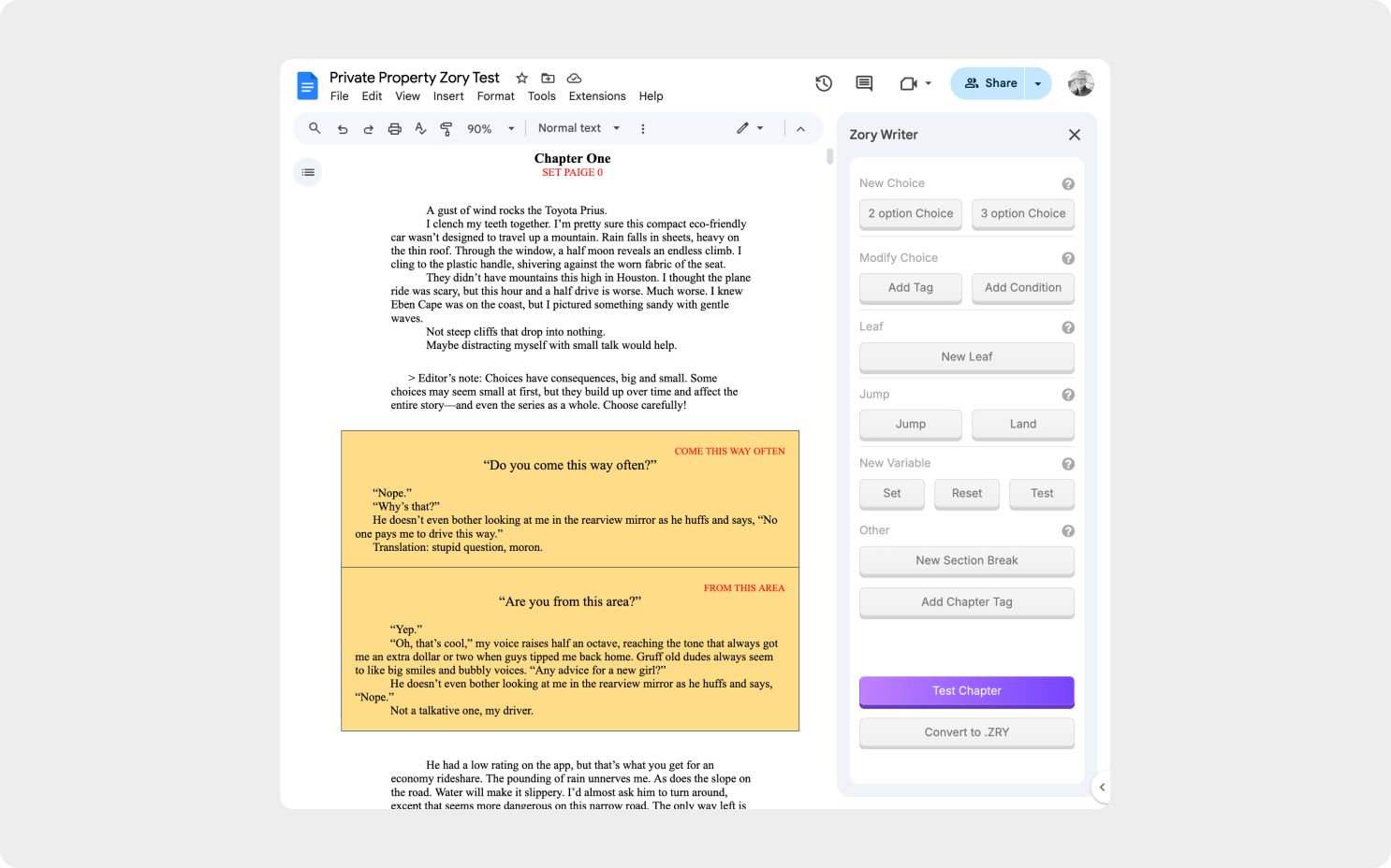
3. Zory Writer: Creating a Design Language for Interactive Authoring
Enabling non-technical authors to create interactive narratives required bridging two different mental models. Existing tools were built by programmers using terms like nodes, branches, and conditional logic. Romance authors thought in scenes, metaphors, and emotional beats.
Early Concept: Color-Coding for Branching Narratives
My initial concept for making branching narratives visual and intuitive in traditional word processors
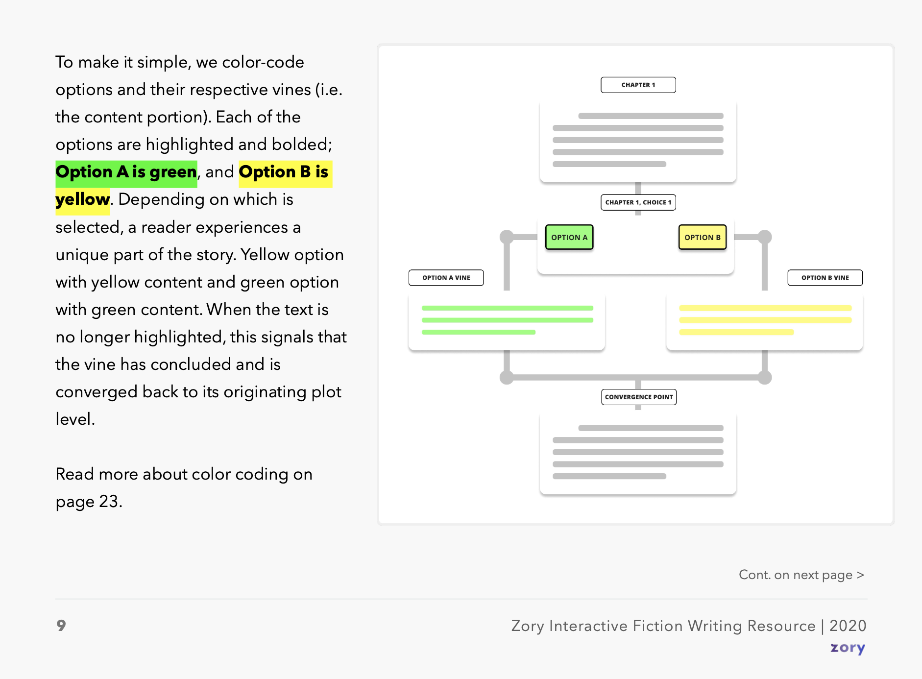
Initial explorations focused on how authors naturally think about story variations. Before collaborating with co-founder Matt Hall, I developed concepts using simple highlights and parenthetical tags that could work in any word processor. This became the foundation for our authoring system.
The key insight was reframing the vocabulary. Traditional interactive fiction used "branches"—implying permanent divergence. We introduced Vines: story paths that could weave apart and come back together. This metaphor shift changed how authors approached their stories. Rather than exponentially complex branch diagrams, they were weaving controlled variations.
The complete framework included 13 simple concepts, four key ones being:
Key Concepts from the Zory Design Language
Vines
Story paths that weave apart and come back together. Unlike traditional branches that diverge forever, vines allow for controlled variation that returns to the main narrative.
Leaves
Content that appears later as a result of earlier choices. Like leaves sprouting from a vine, these passages reveal the consequences of reader decisions chapters later.
Skipping Stones
Single choices that create ripple effects throughout the entire story. One decision can spawn multiple leaves across chapters, books, or even series.
Choice Framing
Options that shape reader perspective without immediate content changes. These choices influence how readers interpret subsequent events, adding psychological depth.
These four concepts represent a sample of the comprehensive design language I developed, which included 13 distinct terms that helped authors think about interactive storytelling in new ways.
Each term was carefully chosen to resonate with writers' existing mental models. While Matt Hall brilliantly engineered the ZRY markup engine that powered everything, I focused on making it feel natural in Google Docs—the tool authors already used daily.
From Author's Manuscript to Reader's Experience
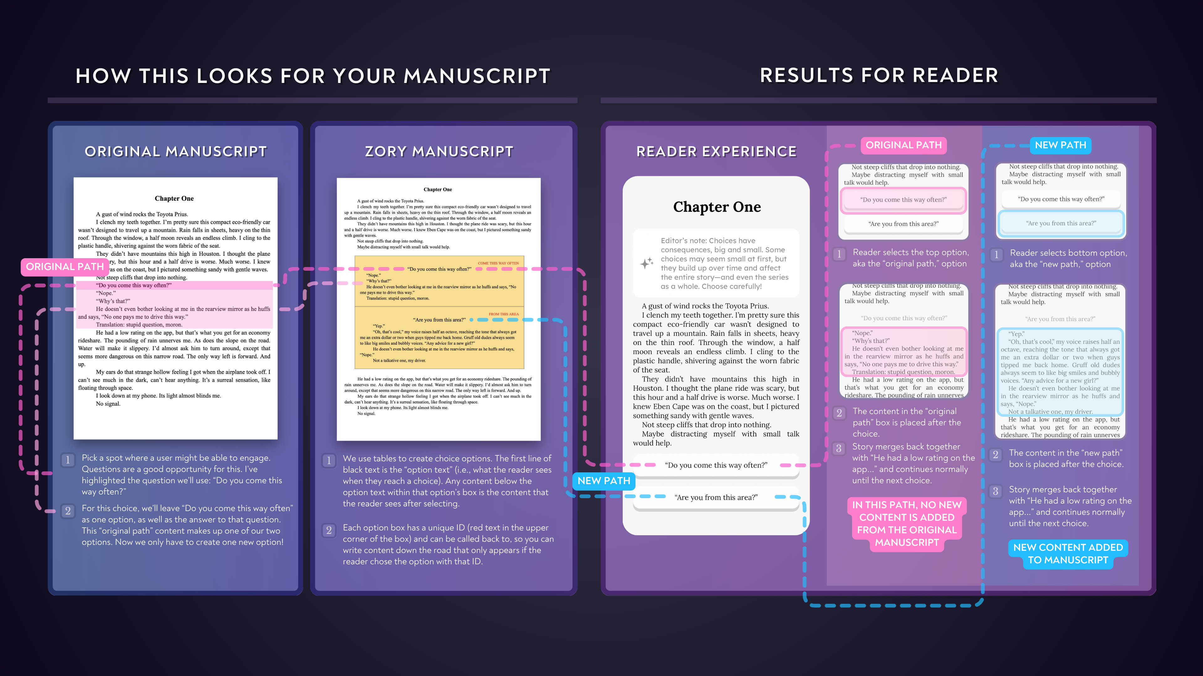
The system's elegance: authors write naturally with minimal markup, while readers experience rich, branching narratives—all within immersive text, not speech bubbles
Author in Docs
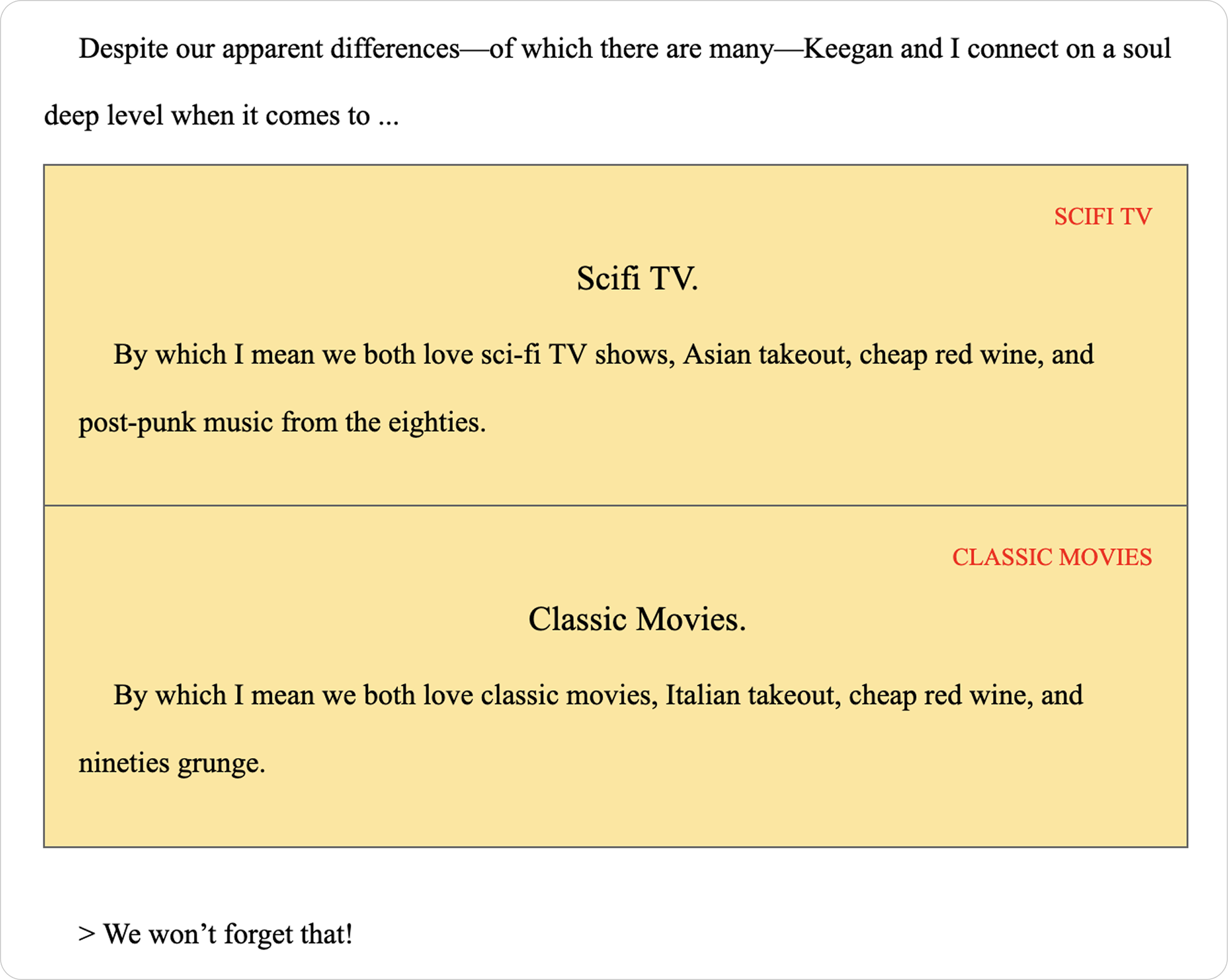
Authors write naturally in Google Docs using familiar tools. Color-coded tables and simple formatting conventions replace complex syntax. The add-on provides one-click buttons to insert choice blocks, validate structure, and preview chapters instantly—no code knowledge required.
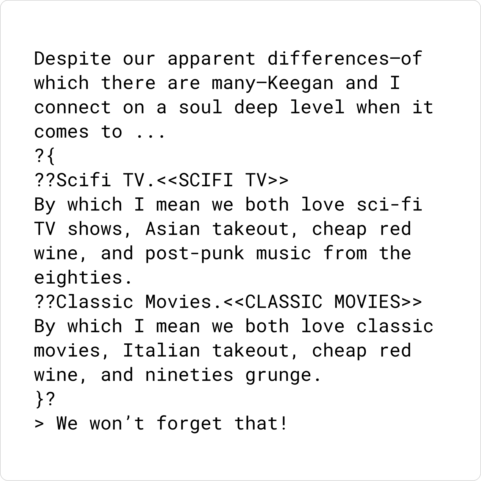
Convert with ZRY
The system automatically validates every choice ID and target, builds the complete branch graph, and packages everything into a .zry file. Authors receive clear error messages if something needs attention. What previously required technical expertise now happens with a single export command.
Run in the App
Stories come alive instantly in the Zory app with full interactivity, monetized choices, and professional presentation. All without touching a single line of code.
The Google Docs add-on interface maintained simplicity. Despite our system being simpler than traditional tools, any friction could interrupt creative flow. The add-on provided one-click insertion of pre-formatted choice blocks with placeholder text, allowing authors to focus on storytelling rather than syntax.
Zory Writer Google Docs Add-on Interface
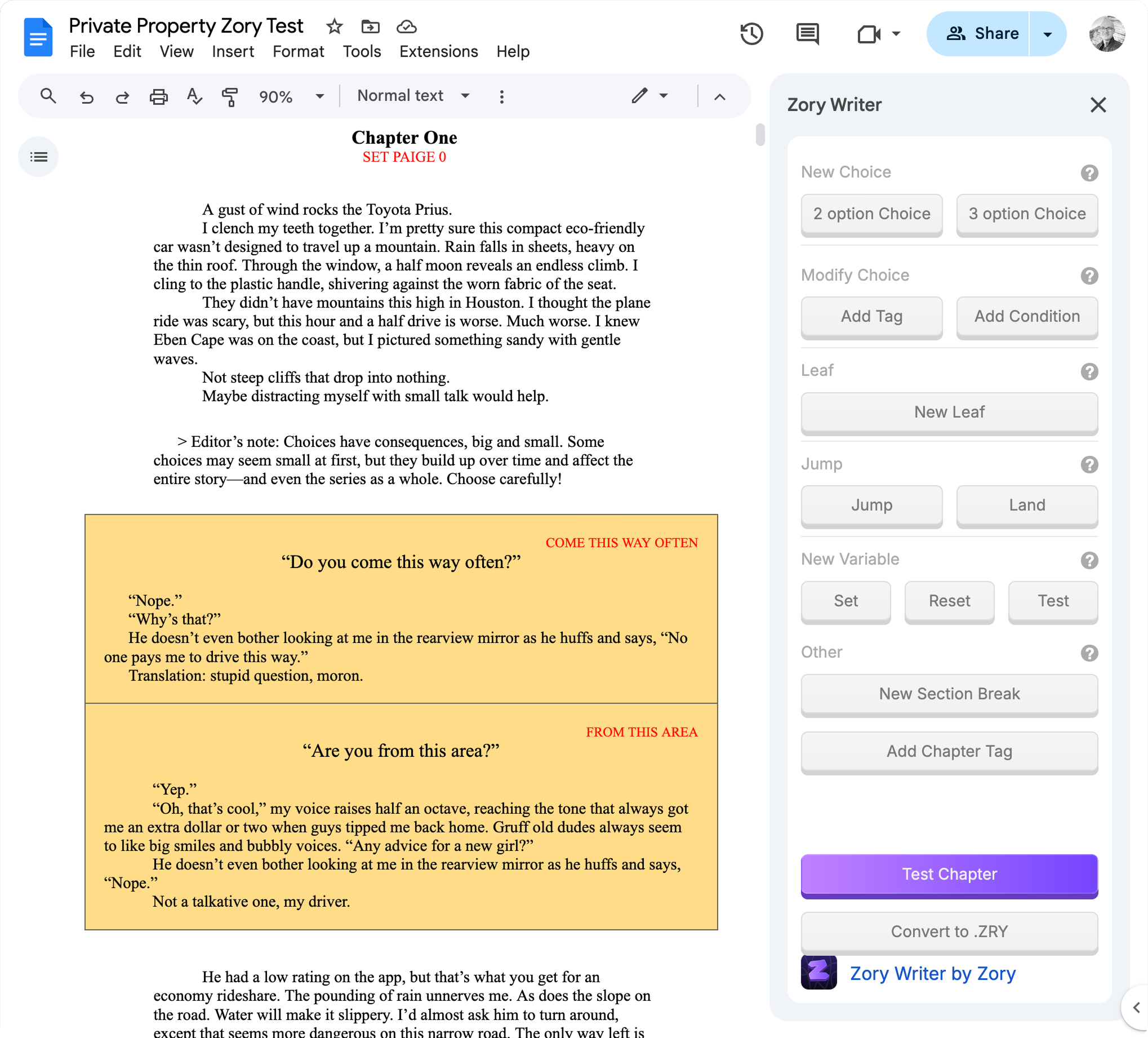
The add-on provided one-click insertion of formatted choice tables and intuitive controls for authors
Authors who had never created interactive content were publishing stories within hours.
By the time we sunset, dozens of professional authors and in-house writers had successfully used the system. The comprehensive documentation became the foundation for author onboarding, and the conceptual framework influenced how the entire team discussed interactive storytelling.
Key Takeaway
The best tools speak the user's language, not the technology's. By meeting authors where they already worked—Google Docs—and using easily-digestible metaphors, we removed the biggest barrier to adoption.